The latest member of the Leica family was unveiled this week, and it’s been making the rounds all over the Internet on account of its unique design philosophy. What can you say about a $6,000 camera that doesn’t have an LCD display, doesn’t shoot video, and doesn’t even shoot JPEGs? Lots of things, apparently.
The Leica M-D is supposed to be all about the process, and going back to “the sheer essentials of photography”. Simplicity. Photography in its purest form. Those are Leica’s own words, mind you.

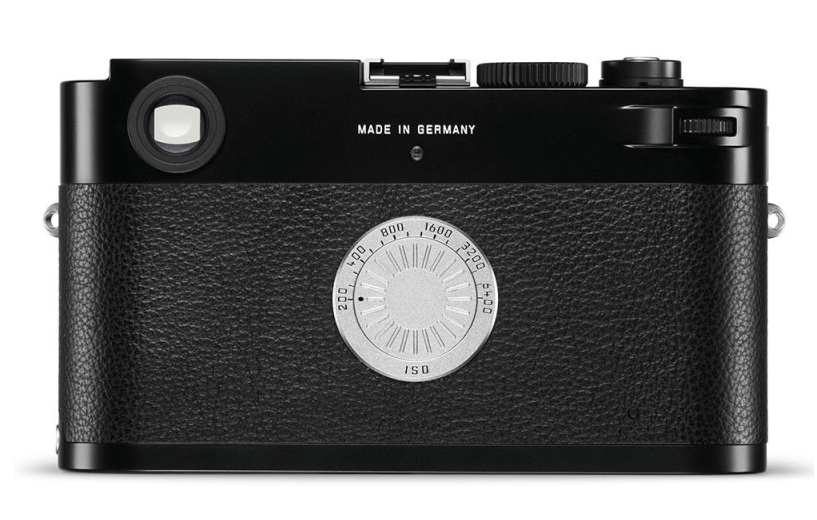
The Leica M-D has an ISO dial where its LCD should be. Image source: Leica.
Simplicity is always a compelling marketing message, and I’ll be the first to admit that on paper, the M-D sounds great — or it would if not for that ludicrous price tag. However, cool concepts not always translate well into physical products, and the new Leica M-D seems to be the new poster child for this unfortunate problem.
The biggest issue with the Leica M-D — there are lots, but this one is particularly aggravating — is the new ISO dial. For context, here’s what Josh Ginter had to say about it:
Aside from the fact this entire camera looks to be, at best, a joke, and at worst, an insult, I can’t get past the positioning of the ISO dial. Are you supposed to reach over there with your thumb when your eye is to the viewfinder? Or are you supposed to set ISO before composing?
I couldn’t agree more with his overall assessment of the camera, but there’s a very good reason the ISO dial caught his eye: it doesn’t make sense.
The ISO dial on the new Leica M-D harkens back to the ASA dials on classic film Leicas.1 This will be instantly recognizable to any Leica enthusiast, and it ensures consistency in Leica’s design language. It also looks really cool. However, there’s a fundamental difference between those old ASA dials and the one on the M-D, and that’s where the whole thing breaks down.

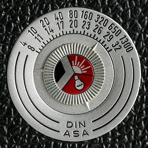
The ASA dial on the back of a classic Leica M3 film camera. Image source: Rama.
Classic film Leicas, like the legendary M3, were fully manual cameras that didn’t even have built-in light meters. On those cameras, the ASA dial didn’t actually do anything; it merely displayed information for the user. It served as a reminder of the particular film stock that was loaded into the camera, so that if you didn’t finish a roll one day and went back to shoot days, weeks or even months later, you could still pick up right where you left off.
Different film stocks have different sensitivities to light — also called speeds — so you need to know what kind of film is inside the camera in order to adjust your aperture and shutter speed. Those old ASA dials were, simply put, a commodity feature, no different from writing that same information down on a piece of paper.
Since light sensitivity is a property of the film itself, you’re effectively setting your ASA by choosing to use one particular film stock over another, and so there’s nothing more to set on the camera. Practically speaking, your ASA will remain constant until you finish the roll and change to a different film stock.2
These intrinsic properties of film and the constraints they place on the photographic process informed the design of the ASA dial decades ago: it needed to be prominently displayed and easy to see at a glance, but there was no need for it to be particularly comfortable to adjust since users would only set it occasionally, whenever they changed film rolls. With that in mind, the placement of the dial on the back plate of the camera was ideal: away from the main exposure controls so as to avoid changing it accidentally, but right in your face so that you’d see it every time you lifted the camera up to your face to shoot. It was a brilliant design.
The ISO dial on the new M-D, however, is nothing of the sort. Modern ISO dials need to be easy and convenient to adjust, because with digital photography you typically need to change the ISO a lot more frequently. The requirements for this dial have changed completely, and unfortunately the classic ASA design translates very poorly to modern digital photography.
This brings us to a sad realization: the Leica M-D isn’t a modern camera designed with simplicity in mind, but merely a poor attempt at replicating the look of the classic film Leicas of old, with little regard for how that design works with today’s technology. This isn’t good design by any reasonable definition of the word, and it certainly isn’t SWEET. It’s just lazy, and that worries me. Leica seems to be a company without a clear vision these days, and the M-D strikes me as yet another warning sign that the company has lost its way.
This isn’t a trivial thing to solve, either. Leica’s main problem is that the very values that once made it a timeless brand are at odds with the disposable nature of digital technology. That’s a very tough mountain to climb. What does the word Leica mean in the digital age? We still don’t really know, but I certainly hope the M-D isn’t it.
Don’t get me wrong, I love Leica, and I hope they can reinvent themselves and find a way to help shape the future of photography, just like they did in the past. They are one of the truly historic names in photography, and the world is better off with them healthy and thriving. However, I suspect it’s going to take a lot more than a repackaged film camera to do that.
It’s hard to move forward when you’re shackled to a brilliant, successful past. It takes courage to break free of that legacy and venture into unknown territory, but sometimes that’s exactly what you need to do. If I were a betting man, I’d say the future of Leica looks a lot more like the SL than the M-D. I may not like it, but that’s what my gut tells me.
Whether Leica has the courage to look forward and let go of their past, we still don’t know. In any case, I suspect it won’t be long before we find out.
-
ASA is a parameter that describes each film stock’s sensitivity to light, and is analogous to the concept of ISO in the digital realm.↩
-
It’s worth pointing out that later film Leicas, like the M6, did incorporate built-in light meters, and in those models the ASA dial was used to calibrate the meter properly. However, you still only needed to set the ASA once per roll of film, so the original design still worked nicely.↩